Rock the Year

Friday, November 30, 2018

Hey there! I'm sharing this layout on both The Cut Shoppe and A Flair for Buttons blogs today. First, I want to show you how I used one of the Traveler's Notebook cut files from the Story Teller group on a 12x12 scrapbook page. It was super easy!


One of the things I like to do with all of my scrappy supplies is to use them in ways that suit me, and that's not always as there were intended. Well, this cut file is no different. I loved the Alphabet one from the minute I saw it. I thought it would be great for a back to school page, which is what I did today. All I did was enlarge it. Yep. I didn't change the proportion or anything. Then I centered it on my page, using it as a back drop for my photos.  See? Easy! Its big, stands out and looks great!


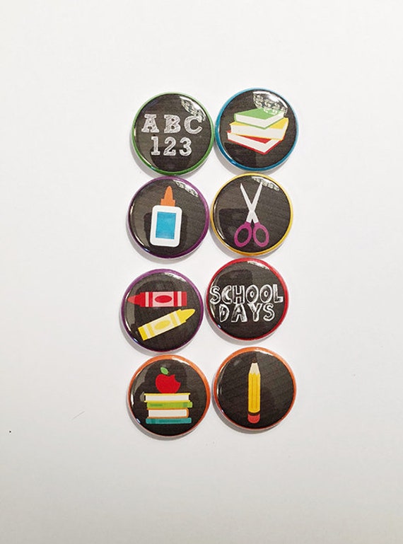
I stuck with the school theme using some Simple Stories School Rocks collection. I was so excited to use the new Back to School2 flair! The books one fit perfectly on top of that green notebook don't you think? How about that ABC-123? Yep. Goes perfectly with this cut file and paper!  Sometimes its fun to go super themed. Today I'm glad I did!


My son loves school so much. It keep him on a routine which is good for all of us, but besides that, he knows it's his place to go to be himself. He likes his teachers and his friends. I'm so happy knowing he wants to be there.

Thanks so much for stopping by my creative view today. Im starting off December right, and plan to crate the whole month. Come back again to see what's new!




Home Sweet SLOme

Wednesday, November 28, 2018

Hey good morning! I'm up on the Paper Issues Blog today with my project for the Pinspire Me challenge. I love this month's board. It's so different!  Well, if you know me, you now I probably  took a different approach today....


So I know you are looking at my page thinking what does this have anything to do with the Pinspire Me board? Well, I was inspired by the brick wall and that became the design of my page.  I cut apart the Kitsch Fall paper from the Fancy Pants Yellow Door collection piecing it across the page to look like bricks in a wall. It was that easy! umm, maybe not that easy. I had to arrange them so it didn't look too busy. I wanted to use the die cuts , and stickers, especially that owl! How cute is he?


I know this is a fall line, but it goes so well with my photo! Bricks for the brick wall, the house for my son's new home and the wise old owl within coffee cup to help him study! See what I did there?


Yes, this is his new home, I still cant believe he's there and not here. I sincerely hope this quickly becomes his home sweet home.  

Thanks so much for stopping by my creative view today. Come back gain soon, I have more to share. Head over to the Paper Issues shop to get some Fancy Pants Yellow Door  of your own. You'll be happy you did. You'll be even happier the you use DEVRA at checkout  and receive 20% off your purchase, See you again soon!


Halloween Things

Saturday, November 24, 2018

Hey there! I'm on The Cut Shoppe blog today and I'm super excited to share my project with you! Why? Because this is one of those rare times when my page turned out almost exactly as I saw it in my head. 

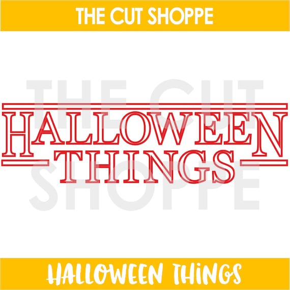
I'd been wanting to use the Halloween Things cut file since I first saw it. But I didn't have a photo! Lucky for me, I got this gem of a photo of some friends and I dressed up at work. It couldn't be any more perfect for this cut file if I'd tried.

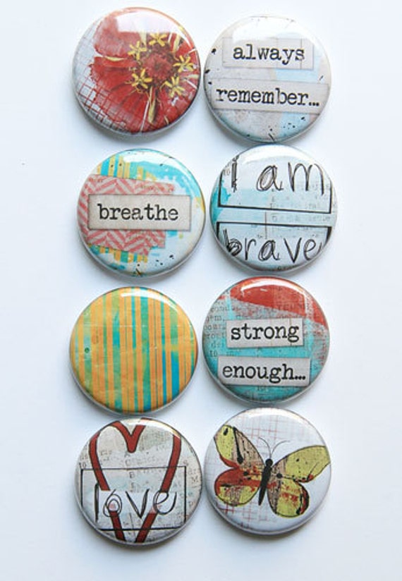
I cut the file out of black cardstock, backing each letter with Vicki Boutin Field Notes patterned paper. Yes, it took some time, but yes, it was also well worth it!  Want to know how I got them placed so well? After I sprayed and dribbled paint down the page, I laid the negative cut space over the white, then placed each letter back into it's original place. I added more black in some of the embellishments, to make sure the title stands out. this page really didn't need much else. I cut a few circles, added some A Flair for Buttons Halloween flair and called it done. I like using a cut file as a title on my pages. This one especially grabs your attention right away don't you think?


Thanks for stopping by my creative view today. Ive got a few more things up my sleeve score back agin soon. Share your projects with us in our Facebook group, The Cut Shoppe Scrap Spot. See you next time.


Dude Played Us!

Saturday, November 17, 2018

Hey there! I'm on the Paper Issues blog today, and I'm playing along with the Let's Get Sketchy challenge. Here is the sketch which you can find in the November Challenge album in the Paper Issues {Friends & Fans} Facebook Group

Ready? Here's my page. So here's the thing about sketches. You can have 10 people using the same sketch and every one will look different. Why? Any number of reasons, we all use different paper, we all have our own style. We can flip it, turn it upside down. Anyway, I love them. And this one does not disappoint. They are often a starting point for me. Sometimes, I follow them exactly. Other times, like today...Well, look for yourself.

I think I used the last of my Simple Stories Li'l Dude for this one. I love these bright colors!  So I stayed pretty close the the sketch on this one. Ok, I added a few layers, some extra bits and bobs, using stickers and  bits & pieces but you see it right? 


If you haven't figured me out by now, I also love a bit of humor too. See this kid? He's laughing all the way home after saying goodbye to his brother when took him to college!  So yeah, he played us BIG time!

Thanks so much for stopping by my creative view today.   We'd love to have you join the fun. You have until Dec 3 to enter your projects for a chance to win a Gift Certificate to the Paper Issues store, where you can find so much new stuff, including Create Paper and Echo Park. Use DEVRA at checkout for 20% off tour purchase.  See you again soon!


Brush Them Chompers

Wednesday, November 7, 2018


Hey there! I'm on The Cut Shoppe blog today. I have a confession. I did it again. I used multiple cut files. Maybe that's my thing? Anyway, my other confession, is that I had no real plan when I began this page,

I knew I wanted to use the new Buffalo Plaid  cut file. I really wanted to stitch it. So I converted the cut line into stitching lines. That's when my plan tarted to come together.  I hadn't intended on filling it with paper, but it was too plain. I offset the file internally, and voila, that part was done.

Now that I had a plan, I chose photos, which led me to paper. I wanted a colorful happy page and went right to my stack of Shimelle Box of Crayons. Paper then led me to frames!  I love frames!  I also like to be kitschy.  The 'smile' frame from the  Instant Camera and 'cheese' frame from Say Cheese  fo with my photos so well I had to use them!  The colors are bright and bold, the frames around my photos are perfect and in the end this no plan thing worked out well!


You have no idea how important these photos are. Getting him to brush his teeth, even him letting us brush his teeth has been a lifelong battle. After some extensive dental work, we were determined to end the battle. It has taken some time, but I can say that every day, we battle less and less. And some days, like this one, he will even try to so it himself. So smile and say cheese indeed. 


Thanks so much for stopping by my creative view today. I hope I've inspired you to try multiple cut files on one project. Some back again soon. I have much more to share.

Wonderful

Thursday, November 1, 2018

Oh hello November. What? How did that happen so fast. Well, nothing like starting the month off with a new project! I'm on the A Flair for Buttons blog today with this layout I made for  the November Challenge with The Cut Shoppe

This months challenge is white on white, meaning use white cardstock for your cut file as well as the background for your project. I will say, I do not usually do this, so yay for trying new things! I used the Go With the Flow cut file, but only used 2 sides of it. I filled in the spaces with some of the softer prints of Amy Tangerine Shine On. I added color with the embellishments. The two pieces of flair I used are from the Let Them Eat cake and Lovely Words sets. They had the color, style and sentiment I was looking for. Over all this was actually quite simple to do. The result is soft yet striking. I'm happy with how it turned out. 


Thanks so much for stopping by my creative view today. Check out The Cut Shoppe November Challenge in our Facebook Group. hope to see you here again. I have lots to share this month.


FREE BLOGGER TEMPLATE BY DESIGNER BLOGS