Top 16 of 2016 with Paper Issues

Saturday, December 31, 2016

Good morning! I'm sending this year out with a bang. For my last post of the year,  I am joining the Paper Issues team in sharing my 16 favorite layouts of 2016. If you want take a closer look, below the photo, I have linked the original blog posts. All however, I shared on Instagram, using my (almost) personal #mycreativeview.


They All Fall Down (row 3, column 4)
The Astronomist (row 1, column 3)
L'il Dapper (row 1, column 4)
Hello (row 4, column 2)
Ahoy Matey (row 1, column 1)
Today (row 2 column 1)
You, Together (row3, column 3)
You are My Champion (row 1, column 2)
High in the Sky (row 3 column 2)
Hello, Love (row 3, column 1)
Beach Bummin' row 4, column 1)

Thanks so much for stopping by my creative view this year. It's been a bit sparse at times, I know. I plan on changing that this year. I have so much to share, including some news so please come back in 2017. Wait! That's tomorrow! 


Coffee and Keys

Wednesday, December 28, 2016

Good morning. Part of making scrapbooking easier is using sketches. Today on the Get It Scrapped blog we are sharing a multi photo sketch. 


I'm drawn to multi photo sketches that can incorporate different size photos and orientation. 

I had three photos to use for this story, all of them 4x6 in size. I saw one of the photo placements could be use as a journaling block. This allowed me to use 2 slightly larger photos in a vertical orientation.

One of our last stops on our cross-country journey was the first Starbucks store where we met our realtor to get the keys to our new house, and of course, coffee as well. From here we piled back into the car, and headed to our new....home.

Thanks for stopping by my creative view today. This is one of my last posts for the year. I'm looking forward to exciting adventures more creating and more blogging in 2017.

 Supplies: PP, die cuts-PinkPaislee, chipboard-Pink Paislee, Freckled Fawn, WRMK, flair-A Flair for Buttons, Alphas-Thickers y American Crafts, pen and adhesive-EK Success

They All Fall Down

Tuesday, December 6, 2016

Hey there! As a patterned paper junkie, I love the topic of today's Get It Scrapped blog article! We are talking about using patterned paper to strengthen design on the page.

I used patterned paper here to help establish emphasis in three ways. The woodgrain paper speaks to the trees and leaves. The floral paper and multi color leaves also emphasizes the outdoors, but also the variety of color seen in my photos. Lastly, the small bit of arrow print plays to direction and movement of the leaves falling. The photos are small and could have easily been overwhelmed by product.  Using these patterns altogether brings unity to the page, while still highlighting the photos. 


My neighborhood is surrounded by trees. This year as the leaves were falling, 
I noticed all of their beautiful shapes, sizes and colors. I decided to document this, 
instead of all the changing colors, which you see in the fallen leaves anyway.

Thanks for stopping by my creative view today. Come back again soon, I've got more to share. 

 Supplies: Patterned Paper- Pink Paislee, Simple Stories, die cuts, puffy stickers-Pink Paislee, 
wood pieces, sticker-Freckled Fawn, die cut Design-Stacie Dietz for Paper Issues, 
Silhouette, pen-EK Success, Adhesive-EK Success, Scotch, Scrapbook Adhesives

Book Club

Tuesday, November 29, 2016

Good morning! Like many of us, I take tons and tons of photos. So why is it only one or two make it onto my pages?  Today, on the Get It Scrapped blog, we are sharing a variety of ideas for getting multiple photos onto our pages. 

The photos were taken on a cell phone in 2010. They are not very good quality, and could only be printed in a small size such as 2x3. I needed to get them onto one page so I could give them some meaning without them getting lost.  I had one 4x6 photo given to me that I was able to crop and use as a larger focal photo. Now the small photos support the larger one, and have meaning of their own. 

Using so many photos on a page can create a busy page with no focus. Printing the small photos all the same size gave them and the page some unity.


The women in this Book Club started as strangers to me, but ended up becoming my very good friends. This was the last gathering I attended before moving away. The first few months after I moved, I phoned in on book club night. It sure would have been nice too have Skype!

Thanks for stopping by my creative view today. I seem to be on a roll now. I hope you'll come back again soon.

Supplies: Patterned Paper, Stickers, Die cuts, flair and alpha-Fancy Pants, pen-Micron, Adhesive-Recollections, EK Success

The Astronomist

Sunday, November 27, 2016

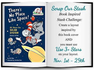
Hello again! Still catching up on blog posts and challenges. Moving on to another favorite challenge, the Book inspired challenge at Scrap Our Stash


I went with the overall space theme. The stars are hard to see because there are stars on the paper, but I added 5 bling stars around the page. One at the end of the title, in the center of the '0', and one near the cluster at the top of the photo, are 3 of them. 


My son has always been interested in space. It's a subject he strays from, but always seems to return to. After a recent trip to the library, he came home with these books to read in his "free time". All I can say is, I'm happy he has interests. I'm happy they are so broad and he has so much information available to him. I have to wonder if this is something he will pursue, or keep as a special interest. 

Thanks again for stopping by my creative view. Come back again, I have lots more to share

Supplies: PP, remade die cuts, stickers- Shimelle for American Crafts, Alpha-Thisckers, bling stars-Freckled Fawn, pen- Sakura, digital cut file-The Cut Shoppe. Silhouette

23 & Me

Hey there! Catching up on some much needed blogging! I had the chance to play along with one of my favorite sketch challenges, Stuck?! Sketches. Laura creates the most beautiful and useful sketches. As usual, I couldn't use it as it is, I had to change it a little. That's another bonus of these sketches, They are so easily adaptable to all styles of scrapbooking!


All I did is reverse the image. My photos seemed to be oriented this way and it worked! My favorite thing about this page? The only patterned paper I used is the background. Everything else are die cuts, stickers and chipboard. Easy peasy. I might have to use this one again!


As long as I can remember, I have been a Ryne Sandberg fan. I know it has to do with being able to watch Cubs games in the summer. They were always day games. I followed his career, watching him get better and better. I'm pretty sure the first time I saw him play, was against the Dodgers at Dodger Stadium.  I was 17.  Needless to say, moving to Chicago and seeing him play at Wrigley was a huge thrill. Even better was attending the game when the Cubs retired his number, also watching him being inducted into the Hall of Fame. After many years of asking I finally received the only jersey I've ever asked for.   So yes, 23 & Me, and one of my children too, whose middle name, just might be Ryne...

Thanks so much for stopping by my creative view today. I know its been a while, too long in fact. Stay tuned, I have more to share.

Supplies: PP, die cuts, washi-Bella Blvd, chipboard-Freckled Fawn, stickers-Freckled Fawn, Bella Blvd, Flair-Accent Scrapbooking, A Flair for Buttons and Freckled Fawn, Wood piece-Gossamer Blue, Alphas-Thickers

Beautiful Magic

Tuesday, November 15, 2016

Hello there! I'm here! Really! I've been scrapping. But, not as frequently as I'd like, or blogging as often as I'd like.  Anyhoo, I am so happy to be sharing this page that I created for the newest article at Get It Scrapped. Today, out pages are inspired by the English Countryside style. 

English countryside makes me think of exactly that. The country. The outdoors, and nature where butterflies inhabit, filled with green grass, trees and flowers.   The distressed wood grain, small floral prints, and subtle hints of gold on the page all speak to this outdoor countryside feeling. 


I had the opportunity to visit a butterfly exhibit for the first time. Seeing them flutter around, landing everywhere was truly breathtaking. I felt like Alice in Wonderland and wanted to follow them around.

Thank you so much for stopping by my creative view today. Come back again soon. I do have much to share,  I need make the time to do it! 

Supplies: Patterned Paper-Simple Stories, PinkFresh Studio, die cuts, puffy stickers and wood pieces-PinkFresh Studio, epoxy stickers, metallic leaves-Freckled Fawn, pen-Micron, adhesive-Recollections, EK Success

Li'l Dapper

Sunday, October 23, 2016

Hey there! I am back today on my very neglected blog. Not for lack of crafting, or content, just due to lack of time to write.  Any way, here is a little something I made last week.

The theme of the page is inspired by the current book inspired challenge at Scrap Our Stash.  When I begin a layout, I normally start with my photo. This time though, I knew what product I would use before anything else. Everything in this collection screamed this challenge. The mustache, top hat, colors, all of it. The twine is looped through the tag. The design of the page inspired by Paper Issues Scraplift Sunday.


This guy had the BEST Special Ed Kindergarten teacher. She arranged for the class to go see Disney on ice. We got him all dressed up for the occasion. I had no idea how he would respond to the show. I sent him with a disposable camera, asking her to take photos of the day so I could see his reaction.  They weren't very good, but I do love how his teacher thought outside of the box for a field trip that all the kiddos in class could enjoy.

Thanks for stopping by my creative view. I know it's been a while. Come back again soon. I do have lots to catch up on.

Supplies: CS- American Crafts, PP, die cuts, tags, alpha, flair, wood  and enamel pieces-Fancy Pants, mist-Tattered Angels, pen-Micron


Love This

Tuesday, October 4, 2016

Good morning! Welcome to my busy blogging week. That means I had time to creat so thats a good thing. Anyway, up on the Get It Scrapped blog today is an article about white space. Why its so popular and different ways to use it. This layout and my description appear in the article.

By using a simple design on a white background, there are no visual distractions.  The bright colored product surrounding the photo, combined with the white background creates great contrast, ensuring the photo remains the focus of the page.   

I'm realizing that the older my son gets, the less time I get to spend with him. Spending a day at Disneyland with my son reminded me to enjoy every moment with him. 

Thanks for stopping by my creative view today. Come back again soon, I have lots to share.
 
Supplies: card stock-American Crafts, patterned paper, stickers, die cuts-Amy Tangerine for American Crafts, clip-Freckled Fawn, enamel dots-My Mins Eye, Freckled Fawn, pen-Sharpie, adhesive-Recollections, EK Success

Cousins Klub

Tuesday, September 27, 2016

Good morning!  Get It Scrapped constantly finds fresh, outside the box ideas for my scrapbook pages. For example, today's article uses CRAYONS in unusual ways. 


I decided to make my own ombre background so I could make custom colored shapes with my die cut machine. For the waves, I used 4 colors of blue crayons, binding them together with a rubber band. Putting them flat against the paper, I colored in an angled back and forth motion across half of the paper. I repeated the process using different colors for the sun and clouds. 


I wanted the waves, clouds and sun to have some texture, simulating movement. creating my own color helped me achieve what I wanted.  I used the Land Ho cut file from The Cut Shoppe to create the waves.


We don't live near family. It's always a big deal when we do  get together. For these cousins, it doesn't matter how much time passes between visits, when they are together, it's like no time has passed at all. I caught them being silly as they usually are. I asked what they were giggling about, and they said we are the Kousins Klub. And that's with a K...

Thanks for stopping by my creative view today. Come back again soon. I have lots to share.

Supplies: Cardstock & Alpha-American Crafts, Patterned Paper-BoBunny, pre-made die cuts-Echo Park, Amy Tangerine, Stickers-Fancy Pants, sequins-Studio Calico, Doodlebug Design, bling-Echo Park, enamel dot-Freckled Fawn, Crayons-Crayola, Wave Die Cut design-The Cut Shoppe, Clouds and sun die cuts by Silhouette, pen-PaperMate, Adhesive-EK Success, Recollections

Party Like a Mother

Thursday, September 22, 2016

Hey there and good morning! Well, I have to say its been fun having so much to share this week. I should do this more often! I'm up on the Stuck?! Sketches blog today share my version of our 9/15 sketch. This is also my last reveal. I've enjoyed my time and look forward to seeing what the new team creates!

Just Nick is one of our birthday celebration sponsors and I used the Flower Burst2 cut file, then stitched all around it. So, I greatly exaggerated the circular element behind the photos. I needed to mov everything around. My photo was facing the other way. This sketch is so simple but can be used in so many ways. I already have 2 other pages I could create with this sketch!

I have an incredible group of friends. We call ourselves "the squad". We get together almost weekly, for Happy Hour, and on this night, a movie. BAD MOMS.  Oh. My. Goodness. This movie was hilarious. We all laughed so hard. I used a combination of paper lines, having to do with daily life and GNO. They were perfect, and so was the evening!

Thanks for stopping by my creative view today. I have more creating to do which means more to share. Come back again soon

Supplies: CS-American Crafts, PP & Stickers-PhotoPlay, Echo Park, flair-Fancy Pants, enamel dots-Freckled Fawn, Must-Heidi Swapp, Cut file-Just Nick, Silhouette, thread-DMC, alpha-Webster's Pages

Beat It!

Tuesday, September 20, 2016

Good morning! Welcome to day two of my busy blogging week. Yay! That means I had time to make stuff. Anyway, lets talk board games today shall we?  Have you ever thought about using a board game as inspiration for a layout?  Neither had I, but what a fantastic idea!  That is today's topic on the Get It Scrapped blog.

I was inspired by the game Operation by Hasbro. This game was the perfect theme for these photos. The two page design and use of red and yellow mimics the full body and colors of the game board. The product choices are medically related, such as the blue bandage tape and actual medical labeling tape used in hospitals,. The comic strip tape and a pun for the title reminded me of the buzzing sound made when the tweezers hit the metal in the game. Hearts and heartbeat stitching used as embellishments are also one of the removable organs in the game. 


In 2009 my husband was diagnosed and survived cancer. His positive attitude and outlook kept him strong thought his recovery. I've had these photos printed for about 5 years, but couldn't bring myself to get them onto paper. I'm still not sure if this is how I envisioned the completed page, But for those most part, this is behind us now. My husband is healthy and cancer free. So maybe it was time to get these glued down and put them behind in an album too.

Thanks for stopping by my creative view today. I always have lots to share so come back again soon.

Supplies: Cardstock: American Crafts, Bazzill, Tape-Johnson & Johnson (blue bandage tape) medical labeling tape (courtesy of Seattle Children's Hospital), Queen & Co, stickers-Lilly Bee, Freckled Fawn, Simple Stories, Cosmo Cricket, Belle Blvd, enamel dots-My Minds Eye, Wood pieces-Studio Calico, Elle's Studio, stitch template-Bazzill, thread-DMC, mist-Tattered Angels, Studio Calico, pen-PaperMate, adhesive-EK Success, Recollections

Like A Boss

Monday, September 19, 2016

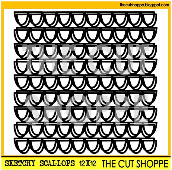
Hey there! I am so excited to be the guest designer at The Cut Shoppe today! I've really been into these files lately. There are so many great ways to use them. Today I used the Sketchy Scallops background file.

I dont know about you, but back to school feels like the start of a new year to me. The summer is all about family, September is all about getting back to me. This layout is a playful way of reminding myself how I feel right now. 


I started by scaling the file to about 9"x9".  Sometimes I like to alter cut files to suit my needs. I took the finished file, then cut it apart so I could layer the scallop strips. I used them above the photo upside down, 


and below my photo, right side up. 

The layered scallops turned out exactly as I has imagined and they added just the right touch to my page. 

Thanks for stopping by my creative view today. Come back again soon. It's going to be a busy week around here!

Supplies: Cs-American Crafts, PP, chipboard, die cuts-Simple Stories, sequins-Doodlebug Designs, cut file The Cut Shoppe-Sketchy Scallops , mist-Heidi Swapp


Stuck?! Sketches

Thursday, September 15, 2016

Hey there! As part of the Birthday Bash going on at Stuck?! Sketches this month, things are changes around a bit.  Today I have a sketch to share with you, but you must head over to the blog to see what else is going on!

Remember, we have some incredible sponsors and prizes to give away this month.

Here is our newest sketch! Isn't it great?  I can't wait to show you how I used it! Stay tuned!


Now head over to the Stuck?! Sketches blog to see some amazing layouts inspired by this sketch and maybe even a surprise!

Thanks for stopping by my creative view today! Like I said, you'll have to stay tuned for my reveal, so please come back again soon!


Nani's Cup

Thursday, September 1, 2016

Holy Moly it's September. How is the world did that happen so fast? Well, another new month means a new sketch challenge at Stuck?1 Sketches. We are celebrating our 3ed Anniversary and there are lots of surprises coming up on the blog all month long! 


First up today is our first sketch of the month.   Isn't is lovely?


 I loved using this sketch. There are so many ways I could have used this because it lends itself to all kinds of moods. I settled on a softer feminine feel to match the photo of the floral coffee cups.  I shortened the large paper strip and moved the small strip to the outer edge. I did that to make the page feel smaller. I also loved this floral circle doily cut file from Just Nick Studio, who is one of our sponsors this month! I layered it over the top of the photo. using pop dots to give it some extra dimension.  See that awesome flair? It's from Accent Scrapbooking, another one of our sponsors. The colors went with my page perfectly! Lastly, I moved the title a littleton exaggerate the cluster in the corner.


I really hope you join the party this month and celebrate with us this month. There will be so much inspiration! 

Thanks for stopping by my creative view today. Hope to see you again soon!

Supplies: PP, premade die cuts, tags, alphas and puffy stickers-Fancy Pants Designs, cut file Just Nick Studio, flair-Accent Scrapbooking, enamel dots-prefer, mist-Heidi Swapp, Silhouette


You Are My Champion

Tuesday, August 23, 2016

Good morning!  On the Get It Scrapped blog today, my team mates and I are sharing how and why we hand journal on our pages. No this is not an earth shattering skill, but it it is something many memory keepers struggle with. 

The main reason I use my own handwriting on my pages is, it's faster. I dont pre-write anything. There is no formatting, or font choosing for me. I write free flowing so it comes out the way I talk. Someone reading would know to read it in my voice. Someone who does not know me, may learn something about me. 

Often if I'm writing just a sentence or two, I will underline my writing, giving it emphasis, so it doesn't get lost on the page.  After much experimenting, I found a medium point, hard nub ink pen that I"m comfortable with. 


This page shares some feelings I've been having about my son and I, what we have taught and learned from each other throughout his life.  I took this from a Facebook post I wrote on his most recent birthday last month. It was much longer, so I edited to the most important parts to fit on this page. A friend of mine commented on my post with the words, You are his Champion. I started crying and knew it would be the right title for this page. 

Thanks for stopping by my creative view today. Come back again soon, I have lots more to share.
  
Supplies: Cardstock-American Crafts, Patterned Paper, chipboard, rub ons, die cuts, clips, stickers and alpha-Shimelle for Amercian Crafts, pen and adhesive-EK Success, Sketch inspired by Get It Scrapped Scrapbook Coach Single & Pretty


-14-

Monday, August 15, 2016

Hey there and good morning! I get to share with you my second challenge reveal as the August guest designer for Scrap Our Stash . Today we have the sketch +3 challenge.


Here is how I used the sketch with stuff from my ever growing stash. This is a really fun sketch and something so different! When I saw the top of the sketch I immediately thought of banners. That led me to photos from my son's birthday last month. I found the cutest  A Banner Day cut file in The Cut Shoppe.  The angles in the sketch combined with my papers made for a bright whimsical page. I used Vellum layered under the banner as well as Various manufacturers, Doodlebug (paper and vellum) My Minds Eye and Freckled Fawn (enamel dots) Fancy Pants and A Flair for Buttons (Flair). Pieces of Washi Tape are at the top of the page and lastly I ran the Velum piece through my Xyron. 


We never know how he is going to respond to his birthday. Some years it's the balloons, others the singing. Not this year. This year was all about the presents, or one in particular that he recognized by shape, and trying to touch the candles on the cake. Mind you, he didn't want to actually eat any cake. Oh, and the balloons? It's a good thing I always get the long lasting helium because that's all he wanted the next day. 

Thanks for stopping by my creative view today and sticking with me through the slow months. Summer is almost over, so I'll be getting back to posting regularly.

Supplies: CS & Alpha-American Crafts, PP & Vellum-Doodlebug Design, washy-Bella Blvd, Flair-Fancy Pants, A Flair for Buttons, die cuts-Elle's Studio, Enamel Dots-My Minds Eye, Freckled Fawn, Mist-Heidi Swapp, Studio Calico, Die Cut design-The Cut Shoppe, Silhouette.

Happy Day

If you are looking for the Scrap Our Stash Guest post, please go here. 

Hey there! Wow. Mid August already. I know in many areas school has started already. Not here. Not only dont we start until after Labor Day, but we are still waiting for summer weather to arrive! Well, regardless, we still have a new sketch for you at Stuck?! Sketches


Ohhh, I love this sketch so much! I can use it over and over and it will never look the same twice. Today I played around with layering beginning with the misted background I created using the JustNick Twilight Zone 1 cut file as a stencil. Next came some twine, vellum and a few pieces of paper. Lastly came the embellishment clusters. I started with the larger pieces, adding smaller pieces   of various shapes and textures. I added some journaling near the title and that was it. Did you notice that I flipped the sketch too?

Here I am making fun of myself again. Well, not really. I was celebrating. After surgery and 6 weeks in leg casts, my son got a surprise and they were removed a week early. I survived! Yes, ME. I survived the surgery, the recovery, the immobility, the driving to and from school, the additional lifting...all of it! I said I could handle it because it was 6 weeks for the rest of HIS life and I did. I knew it would be difficult and challenging and it was. So yes, it was indeed a happy day and I celebrated!

Join this sketch challenge for your chance to win a prize from our sponsors Lindy's Stamp Gang and ShopEvalicious.

Thanks so much for stopping by my creative view today. Come back gain as I have lots to share

Supplies: CS & Alpha-American Crafts, PP, chipboard, die cuts, stickers, bradz & enamel dots-Simple Stories, twine-Doodlebug, die cut/stencil-JustNick Twilight Zone 1 , Silhouette, mist-Studio Calico, Heidi Swapp, pen-EK Success

Simle & Wave

Tuesday, August 9, 2016

Good morning!  I  am happy to be a part of today's Using Trendy Colors article on the Get It Scrapped blog. I'm always looking for ways to make my scrapbooking easier and faster. Starting with color is not usually a choice I make.

I chose a bright color combination of Chartreuse, Azalea and Carrot with touches of gray called Flashy, that I found on a wedding trend website called MagnetStreet. They describe this combination trend : "Chartreuse is boldly fun and the ultimate in uniqueness! Neons are nearly everywhere these days, and weddings are no exception. This palette shows that neon hues can still be classy and simple, especially when grounded with a neutral."

When I think of summer, I think of bright, warm colors. Here, they contrast the blue in the photo so it stands out. I used silver in place of gray. It adds more shine, like sun glistening on water.

This family vacation was care free, relaxing and full of silly selfies. Taking a close up of my son and I with our mouths full of braces is one of many taken that week.

Thanks for stopping by my creative view today. I've got some stuff coming up so stop by again soon.

Supplies: Cardstock-American Crafts, Patterned Paper-Simple Stories, Imaginisce, stickers-imaginisce, Freckled Fawn, enamel dots-Freckled Fawn, Alphas-Imaginisce, American Crafts, Glitter-Martha Stewart, adhesive-EK Success, Tsukineko, Pen-Micron

Hello

Monday, August 1, 2016

If you are looking for Stuck?! Sketches post, please go here

Well, hello again! I have exciting news. I was asked to be the Guest Designer at Scrap Our Stash this month! 

In this role I will be sharing layouts I created based on the two August challenges. The first is the new Book Inspired Challenge. 


When I first looked at the book cover, I saw the maps and thought of a travel layout. The more I looked at it, the more I was attracted to the cursive writing in the hand. The script made me think about this "Hello" paper that I purposely purchased after getting tickets to see Adele in concert. It was the perfect inspiration for this challenge and to create a layout about the evening. The arrow near the photo of my friend and I is the decorative paper clip. 

The layout is very busy, so this helped draw the attention to us. I also created layers to keep the photos in focus. The strips at the bottom are pieces of confetti blown at he end of the concert. 


Thank you so much for stopping by my creative view today. Join this months challenges at Scrap Our Stash for an opportunity to win a prize or become their next guest designer.

Supplies: CS, die cuts, chipboard-Crate Paper, phrase sticker-Thickers, paper clip-Freckled Fawn


GNO

If you are looking for Scrap Our Stash post, please go here
Good morning! Can you believe it's August already? Where is the summer going? Well, the good thing about a new month is a new challenge at Stuck?! Sketches. Here is our new sketch. It has so many possibilities!


Here is how I used the sketch. I chose a couple of horizontal photos so I flipped the sketch vertically. I shortened the background strip, but left the rest of the sketch pretty much the same. There are so many ways to play with this sketch, I had to stop myself from soloing more.

If you know me, you know I love baseball. So when a friend invited me and my son to go with her to a game, of course I said yes. Well, the invitation turned into a much needed Girls Night Out. We enjoyed a family free evening filled with, good food, wine, a great game and great company. 

Join the challenges this month for a chance to win prizes from our two sponsors Scrapbook Circle and Scrapmats. Please read the rules on the Stuck?! Sketches blog.

Thanks for stopping by my creative view today. I hope to see you again soon, I have lots to share!

Supplies: CS-American Crafts, stamp-KaiserKraft, ink-Colorbox, Patterned Paper, Alpha, puffy stickers, flair-Fancy Pants, die cuts-Freckled Fawn, Echo Park, chipboard-Bella Blvd, Paper POP, Parker on the Porch for Paper Issues, mist-Heidi Swap


Kids

Wednesday, July 20, 2016

Hey there! I'm all caught up so the rest of the month is scrapping whatever I please. Today is all about Scrap Our Stash. I am sharing pages I made for both July challenges today.

This first LO is based on the Stash challenge. Find inspiration from the book "Oh the Places You'll Go" by Dr. Suess, using 5 patterned papers and a circular element. I did this right after we got home from vacation after July 4. It's a Sketch from Paper Issues and wow, it got my mojo going!


I don't know where he thought he was going, but he booted his Uncle out of the captains chair and took over the wheel. I'm guessing he was discussing his plans with Hank the Bulldog, but we didn't catch what they were saying. I can tell you that Uncle Brian had to jump back in to steer, because we clearly weren't going where we were supposed to!  So yes, Oh the Places You'll Go!  There are 5 patterned papers, (wood, plaid, star, triangle, dots) a few round brads and a round sticker.

This next page is for the Sketch +3 challenge.  I used Simple Stories (game card die cuts), Theresa Collins (my guy and hexagon stickers) and Uniball pen (doodled lines on navy paper and around 'notes' above photo). I saw this Preppy Plaid cut file at The Cut Shoppe and loved it. It was perfect tot use as the background for this page.


While waiting at the doctors office one day, my son grabbed a coloring sheet and started coloring. I couldn't remember the last time he did that. It just struck me that as fast as he is growing up and becoming more independent, I was so happy to see a part of him that was still a little kid. 

Thanks for stopping by my creative view today. I've got lots of ideas in my head which means more pages and posts, so come back again soon

Supplies: Ayyeee Matey: CS-American Crafts, PP, washi, die cuts, stickers, chipboard & brads-October Afternoon, twine-Doodlebug, pen-EK Success

Supplies: Kid at Heart: CS, alpha & pen-American Crafts, PP-Lilly Bee, stickers-Echo Park, Theresa Collins, Jillibean Soup, die cuts-Simple Stories, Lilly Bee,  Cut file-The Cut Shoppe, Silhouette, flair-Fancy Pants, enamel dots-Studio Calico, Freckled Fawn, Perler, ink-Studio Calico, washy-queen & Co., Sketch, Amy Close for Paper Issues


SaveSave

Strong as an Ox

Tuesday, July 19, 2016

Good morning! I'll bet you've never thought about using a metaphor as inspiration for a scrapbook page. Well neither had I. Today's article on the Get It Scrapped blog shares several metaphors translated on to the scrapbook page. One of my favorite things about Debbie Hodge at Get It Scrapped is her continuous flow of new ideas to keep scrapbooking exciting.  

Recently, my son had major surgery on both legs. This page shows his recovery progression from learning how to go up the stairs with casts, to walking in the front door the day the casts came off.  I felt "As Strong as an Ox" was the most fitting metaphor to describe my son. 


The linear design, primary colors, tonal patterns, the gradual increase in height, and the weight lifters  all match the progression of recovery in each photo. All of this speaks to strength, both literally and metaphorically. By using the tonal patterns, I was able to keep the photos visible. As I was searching for ways to embellish, I came across the weightlifting cut files. I couldn't have asked for a better metaphorical choice.  They also appear to ground the photos, by lifting them up. The black also gives a nice contrast. 

Thanks for stopping by my creative view today. Come back again soon, I always have something to share

Supplies: Cardstock-American Crafts, Patterned Paper-Bella Blvd, BoBunny, wood pieces-Crate Paper, Studio Calico, ink-ColorBox, Alphas-WRMK, Lilly Bee, Mist-Tattered Angels, Die Cuts-Silhouette, Pen & Adhesive-EK Success 

Well Done!

Friday, July 15, 2016

Good morning! Today is a great day! It's reveal day at Stuck?! Sketches as well as my younger son's birthday. So, with out further delay, here is the second July sketch. Remember that playing along gives you a chance to win prizes from our sponsors. See the rules for details. 


Would you look at that. I pretty much followed the sketch! I received a contest prize from American Crafts that included this collection. I don't usually buy fall/Thanksgiving themed papers, so it was a nice change to play with these colors. Challenging, but fun. I used a mix of patterns for balance. Then I swapped out one of the photos for a journal card and created an embellishment cluster around the title. Im in a stitching phase right now, so of course I had to add some to my page. 


I make Thanksgiving every year, and have for the past 25 years. It's my thing. I love having people over, and my door is open to anyone who has nowhere to go. But, I also haven't lived near family for the past 25 years, so someone has always come to visit me so I am not 'alone'. This year, I invited some friends over, and at the last minute, my sister came as well. We prepped and cooked for two days, without any arguing and had the most amazing Thanksgiving I can remember. 

Thanks for taking a look at my creative view today. Come back again soon. I have lots up my sleeve!

Supplies: CS & alpha-American Crafts, PP, die cuts, stickers, wood pieces-Imaginisce, doily-DoodlebugDesign, stitch template-Bazzill, thread-DMC


SaveSave

Badge of Honor

Friday, July 1, 2016

Hey there and happy July to you. Wow, I can't believe how fast the first half of this year has passed by. Well, new month, means a new sketch challenge at Stuck?! Sketches. Today we have for you a multi photo sketch. I found this one really fun to use!


I finally broke into these papers. I actually chose them before anything else. I don't usually work that way. But I wanted to use the frames, and I loved the idea of using the flower cluster on the paper.  At the same time, this photo was sitting near the top of the pile. It's personal, It all came together after that. But a story I wanted to tell. The 2 smaller photos go hand in hand with the larger one. The middle frame is filled with purposeful embellishments and a few of the inspirational word phrase stickers, some in pun. It's a very busy page, so I straightened out the sketch design, moved the title to the bottom, and omitted the additional background paper.


As I said above, this page is personal. I found this floating around Facebook one day. I saved it and printed it, not sure of my intention beyond tat. Having a child with special needs I can relate to every single sentence. Sometimes I need to remind myself that it's ok. That I'm ok. 

So come join the fist July challenge for your chance to win prizes from this months sponsors. 


Thanks so much for stopping by my creative view today. I've got a good plan this month so come back again soon.

Supplies: PP, stickers, die cuts, bradz, frames-Simple Storeis, Alphas-Simple Stories, American Crafts, mist-Heidi Swapp


FREE BLOGGER TEMPLATE BY DESIGNER BLOGS