More than a Hug

Sunday, June 29, 2014

Hey there and Happy Monday.  Because this is the 5th Monday in the month, there is a bonus challenge at Let's Get Sketchy.   This week we would like to see how you are inspired by this photo.   


My first thought about the photo: triangles and green. So, I created this.


I used a Silhouette cut file on the white cardstock. I laid it over a piece of green ombre printed paper. Triangles and green. Done. It needed some contrast, texture and dimension, so I added the yellow, the border and the title. It's fairly simply designed, but has lots of detail. It took less than an hour to out together too.

Thanks for looking at my creative view. Now it's your turn. Create something and share it with us at Let's Get Sketchy.

Supplies: CS-Bazill, PP-Echo Park, Stickers-American Crafts, Simple Stories, Wood veneer-Studio Calico, Mist-Tattered Angels, chipboard-My Minds Eye, Alphas-Basic Grey


Water Play

Tuesday, June 24, 2014

Hello, Hello! I'm back with another creation that I think is super cool!  Today I am sharing another page created for Get it Scrapped. The assignment? Water Play.  I pondered this idea for only a moment. Beach? Maybe. Pool..Oh Pool! I have a swimmer!


In these photos, my son is racing the 100M Butterfly at a recent swim meet.  
The title is a play on words. It's something I like to do in my titles.  I had never seen him swim this race so well and so fast. He really was "fly-ing".  I chose to use colors and products that are motivating for an important event, rather than swim or water themed products.

Everything on the page has purpose and intent. The blue paper has silver 'bubble' like print. vellum with dots, wave print tape, motivational sayings, silver paper, paint drops, blue vellum title and paint drops. All to push the idea of the swimmer in the water.

Supplies:Papers-Doodlebug designs, Fancy pants, Bazzill, SEI. Washi-Queen & Co. Stickers-Simple Stories, Doodlebug Designs, Freckled Fawn, Alphas-Freckled Fawn, Mist-Tattered Angels, Heidi Swapp. Sketch-My Scraps & More.


...And the Braces are Off

Sunday, June 22, 2014

Happy Monday! It's the first Monday of Summer! Mondays also mean it's reveal day at Let's Get Sketchy.  This week I am using a one photo sketch. 


I decided to use the photo I asked the dental tech to take right after she removed my braces. In the dental chair, no filter, just me literally grinning ear to ear. 


I've been reluctant to use the last few pieces of this Fancy Pants, Be You collection, but decided now was the time. The colors and patterns were exactly what I was looking for. The general design of the sketch is there, but I changed many of the details. I wanted the photo and papers to be the focus, so the embellishments are a minor focus here. I love that gold butterfly. It goes well with the papers and the page.

Come join us this week at Let's Get Sketchy. You'll see my LO as well as my teammates. I'm sure you'll find some great inspiration.

Supplies: PP, chipboard, rubons-Fancy Pants, Stickers-Fancy Pants, American Crafts, Pearl-Prima, Resin Flower-Freckled Fawn, Ink-Studio G-Mist-Heidi Swapp, Studio Calico, Butterfly-Jenni Bowlin, Pen-EK Success


Summer Picnic

Saturday, June 21, 2014

Good Morning. This month has been all about team reveals for me. Today is no exception. I have been trying to finish up that big project. Between that and my team commitments they're hasn't been room for much else. I'm not complaining. I still get to make the creative time, and that's really all that matters.

Today's LO is my reveal for Scrap Stuffz' Inspired by.  It is inspired by this colorful Summer Subway Art.  Subway art has been a trend everywhere, but I have not yet embraced it or used it. Well, here's my chance. 
I looked at the art and saw it as art. But I also saw the colors and the theme of the art: summer. I decided to use the subway as it is on my page. I chose a photo of my boys having a picnic in the backyard to represent some of the simple pleasures of summer.


Every now and then, I enjoy putting a page together like a puzzle. Pieces of inspiration can come from many different places.  The inspiration for the design and product choices of the page came from both Scrapbook Challenges Sketch #398/Full House and Scrap & Play. I saw this fun sketch at Scrapbook Challenges. I used all the flags that came with the paper collection to create the burst. I divided some of them with pieces of washi tape. This particular tape has all the colors in the paper. Bold, yes, but fun and striking as well.  Scrap & Play challenge #3 is a tic tac toe board. I used Fancy Pants, Buttons and chipboard, and all from the same collection.  This particular Fancy Pants collection screams summer, and was a no brainer choice for the overall theme of the page.

Thanks for stopping to take a look at my creative view today. Head on over to Scrap Stuffz' Inspired by and add your project. Surely you much be inspired by Subway art as I was today!

Full House: 2 wood veneer-people, 2 mist-yellow & white, 2 alphas (date on subway art), 5 buttons, 5 strips of washi, 

Supplies: CS-Bazzill, PP, flags, chipboard, stickers and buttons-Fancy Pants. Washi-Freckled Fawn, Wood Veneer & Mist-Studio Calico, pen-EK success

Our Hawaii

Tuesday, June 17, 2014

Good Morning. I am sharing another LO I created for Get it Scrapped.  We were asked to create a 2 page LO on in a grid design. 

I often do 2 page layouts, I even use grids. But I wanted to challenge myself. I don't often use small photos. The first idea that came to me was using multiple photos to tell a quick story of our trip to Hawaii.  I would divide each photo by stitching actual grid lines. 


I mixed random silly photos of our trip with papers and embellishments meant to enhance the story. It's fairly simple, but it shows our vacation in a nutshell.

The grid design works here because these are individual events. By placing each element in it's own square, you see them separately.

Sipplies: Paper-Basic Grey, Simple Stories, Bo Bunny, Paper Accents, Thread-DMC, Wood Veneer-Citrus Twist Kits, Studio Calico, Recollections. Paper Clips-Freckled Fawn, Stickers-Simple Stories, Jolee's, Freckled Fawn, Ink-Memento, Washi Tape-Recollections, Stamp-Kate Spade, Alphas-American Crafts, Glitz Design

As always, thanks for taking a look at my creative view. 


Game Time

Monday, June 16, 2014

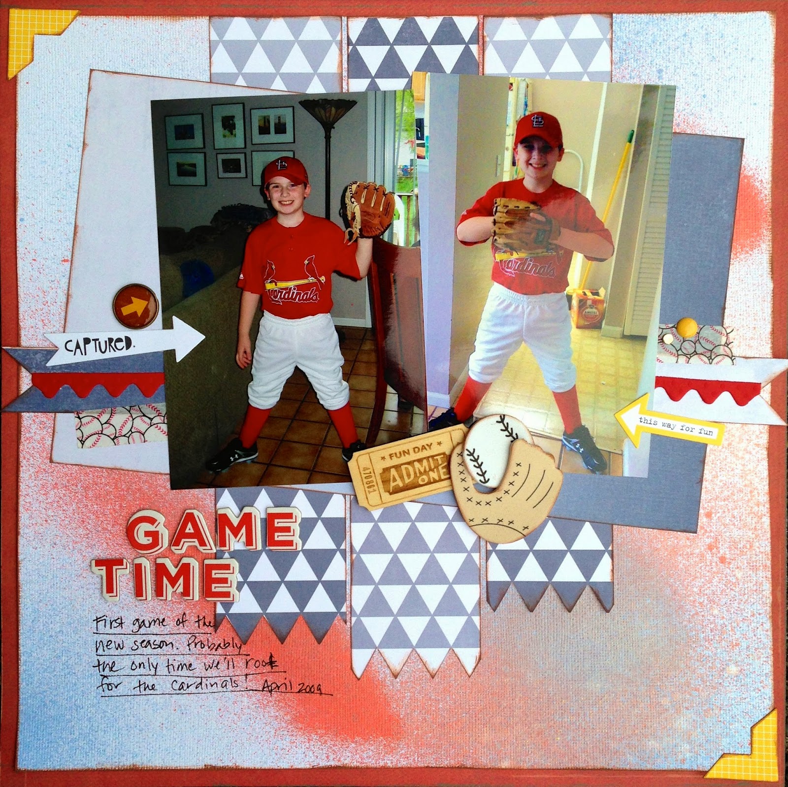
Oh, Hello, hello! It's a great day!  Today we are shaking things up a bit at Child's Play Challenges. That's right, it's Sunday and it's the 15th. Not only is it Craft Challenge time at CPC, but we are having a crossover challenge with Scrap Our Stash Challenges. They are a fantastic challenge blog focusing on using your stash. If you are unfamiliar with them, then this should be a great introduction.

As part of the crossover, there are 2 parts to this challenge. First, use the sketch provided by Scrap Our Stash Challenges. Totally awesome and fun to use!

Second, is to use our crafty inspiration photo. That's right! TIE DYE


We made tie dye shirts every fall. My Mom was a teacher and when school started, she made tie dye tees for her class to wear on field trip days. 


What I tried to do on my page was to create my own tie dye look.  I sprayed mist randomly and heavily all over the paper hoping it would drip and blend. It didn't. I used it anyway. Then I remembered I had some ombre papers. It works. The color in tie dye fades the further away from the center. Ombre can be used light to dark or dark to light. Not what you wold expect for a sports page? Me neither, but after added some yellow as a contrast color, I'm really happy with my results.

You should now head over to both Child's Play Challenges.  and Scrap Our Stash Challenges.  Create a LO and post it to both blogs for your chance to win the monthly prizes.

Thanks for sharing in my creative view. I'll be back before you know it.

Supplies: CS & border strip-Bazzill, PP-Echo Park, Crate Paper, Stickers-Bella Blvd, Brad & wood chip-Freckled Fawn, Washi-Queen & Co, enamel dot-MME, Alpha-American Crafts. foam shapes-School House.


H2O, Beach, Sand & Sun

Tuesday, June 10, 2014

Hello, hello!  I'm so happy to share my LO today. It's my first for Get It Scrapped.  The article we are talking about today is using large scale geometric patterns as background for a page. 

I went BOLD.


My younger son is having the time of his life in the sand at the beach in Hawaii
 
I used circles as my background shape.  The bright colorful circles remind me of the sun, beach balls and beach umbrellas on a hot day.  The circles work here with the color of the shirt in the photo, as well as it being a beach themed page.  


In order to still showcase the photo, I used a contrasting shape papers (stripes and chevrons) and a large matte. The repetition of the colors in the striped paper tie the page together. the papers act as embellishments themselves, so small clusters to enhance the beach theme is all that is necessary.

Thanks for taking a look at my creative view today. 
 
Supplies:-Papers-Simple Stories, BoBunny, Stickers-Simple Stories, twine-Doodlebug Designs, Bling-MAMBI, Queen & Co, Enamel Dots-My Minds Eye, Wood Veneer-Studio Calico, Alpha-Americn Crafts, Ink-ColorBox, Pen-EK Success

Proud

Monday, June 9, 2014

Good Monday to you!  That means it's time for another challenge at Let's Get Sketchy.  


Great sketch right? I think so too. There is so much to do with it!  It was a great one for yet another Bar Mitzvah LO. I was able to keep it simple, like the rest of the pages in the album.  I'm almost done, I promise.


I flipped the sketch and added some extra vertical strips, as well as an embellishment cluster. The title blends into the papers on purpose, in order to keep the focus on the photo.  

Thanks for taking a look today at my creative view.  Now head over to Let's Get Sketchy  and play along.

Supplies:
CS-Bazzill
PP-Theresa Collins
Stickers-Fancy Pants, Theresa Collins, 
Twine-MME
Alpha-American Crafts
Mist-Tattered Angels 


Bake Me a Cake

Wednesday, June 4, 2014

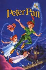
Hi there! Happy Wednesday. Wednesdays are good days. It's reveal day at Child's Play Challenges.  We have a fun challenge for you. It's Classic Movie week! In case you aren't familiar with Child's Play, the idea is to create a LO inspired by the classic toys, movies, book and games that are chosen for each challenge.


Ok, what I remember most about Peter Pan and my childhood was seeing it live on stage with Sandy Duncan as Peter Pan.  I couldn't think of anything to use to tell that story, so I went a completely different route. Color. Green to be precise. 


One of the benefits of waiting until the last minute to do an assigned project is getting to search around other blogs for inspiration! I started with a sketch from Boys Rule Scrapbook kits.  Then I saw Scrap Our Stash has a challenge to use monochromatic colors and 5 different embellishments. I had already decided to use green on the page. Well, I used ONLY green as well as, washi, paint, mist, enamel dots, bling and sequins. 

Join us this week at Child's Play Challenges.  Dig in to your childhood memories or create something inspired by our photo!

Thanks for stopping by to see my creative view today. I'll be back again later this week

Supplies-
Washi-Recollections, My Minds Eye, WRMK, Queen & Co
CS-Bazzill
PP-October Afternoon
Paint-Making Memories
paint roller-American Crafts
mist-Tattered angels
sequins-Michaels, Studio Calico
enamel dots-MME
bling-Queen & Co
Alphas-Simple Stories, AC


ScrapbookGeneration Blog Hop

Monday, June 2, 2014

Welcome to the Scrapbook Generation Blog Hop for June. You should have come here from Steffanie's blog.  If this is your first stop, you might like to begin at the Scrapbook Generation blog and then hop through each link from there.

have been working on a project the past few months. During the month of May, I committed myself to really putting the effort to get it completed. I am so happy I pushed myself to do this. As of today, I have about 5 LO's left to do and it will be completed. One, (and pretty much the only) reason I was so successful in my progress is because of Scrapbook Generation sketches. I used them for every 2 page LO in this project. There are at least 20 in this album, and I would not have been as close to finishing as I am without them.  


Oh, the project, some of you may have heard me mention it just once or twice...The Bar Mitzvah Album...

This LO is from the party. It is tradition that the guest of honor be raised in the chair during the dance called the Horah. Well, somehow my Grandmother and I were raised as well. I can tell you in no uncertain terms, that Nani enjoyed it much more than I did!

I used a sketch from the Feb 2013 Super Saver Kit. I changed the photo sizes and adjusted the photo design on the right side. The sketch called for 2 horizontal photos. I re-arranged them to fir the two vertical ones instead.  

What has been my lifesaver in this project, is the multitude of sketches for 4x6 photos. I thank you Scrapbook Generation  from the bottom of my heart.

You can find the SG sketches in their books and as downloads in the SG store, and there is a free one every month in case you wanted to try it out.

Please leave a comment on each blog and one lucky commenter will receive a free sketch bundle of their choice from the store. The winner will be drawn on Monday, June 9th which leaves you one week to leave a comment.

Next on the hop is CassieThank you so much for stopping and taking a look at my creative view today. If you don't already follow me, it's easy to do.Just add your name to  the link on the right.  

In case you get lost at any point, here is the list all the blogs
Scrapbook Generation blog - http://scrapbookgeneration.blogspot.com/
 
FREE BLOGGER TEMPLATE BY DESIGNER BLOGS