Cousins Klub

Tuesday, September 27, 2016

Good morning!  Get It Scrapped constantly finds fresh, outside the box ideas for my scrapbook pages. For example, today's article uses CRAYONS in unusual ways. 


I decided to make my own ombre background so I could make custom colored shapes with my die cut machine. For the waves, I used 4 colors of blue crayons, binding them together with a rubber band. Putting them flat against the paper, I colored in an angled back and forth motion across half of the paper. I repeated the process using different colors for the sun and clouds. 


I wanted the waves, clouds and sun to have some texture, simulating movement. creating my own color helped me achieve what I wanted.  I used the Land Ho cut file from The Cut Shoppe to create the waves.


We don't live near family. It's always a big deal when we do  get together. For these cousins, it doesn't matter how much time passes between visits, when they are together, it's like no time has passed at all. I caught them being silly as they usually are. I asked what they were giggling about, and they said we are the Kousins Klub. And that's with a K...

Thanks for stopping by my creative view today. Come back again soon. I have lots to share.

Supplies: Cardstock & Alpha-American Crafts, Patterned Paper-BoBunny, pre-made die cuts-Echo Park, Amy Tangerine, Stickers-Fancy Pants, sequins-Studio Calico, Doodlebug Design, bling-Echo Park, enamel dot-Freckled Fawn, Crayons-Crayola, Wave Die Cut design-The Cut Shoppe, Clouds and sun die cuts by Silhouette, pen-PaperMate, Adhesive-EK Success, Recollections

Party Like a Mother

Thursday, September 22, 2016

Hey there and good morning! Well, I have to say its been fun having so much to share this week. I should do this more often! I'm up on the Stuck?! Sketches blog today share my version of our 9/15 sketch. This is also my last reveal. I've enjoyed my time and look forward to seeing what the new team creates!

Just Nick is one of our birthday celebration sponsors and I used the Flower Burst2 cut file, then stitched all around it. So, I greatly exaggerated the circular element behind the photos. I needed to mov everything around. My photo was facing the other way. This sketch is so simple but can be used in so many ways. I already have 2 other pages I could create with this sketch!

I have an incredible group of friends. We call ourselves "the squad". We get together almost weekly, for Happy Hour, and on this night, a movie. BAD MOMS.  Oh. My. Goodness. This movie was hilarious. We all laughed so hard. I used a combination of paper lines, having to do with daily life and GNO. They were perfect, and so was the evening!

Thanks for stopping by my creative view today. I have more creating to do which means more to share. Come back again soon

Supplies: CS-American Crafts, PP & Stickers-PhotoPlay, Echo Park, flair-Fancy Pants, enamel dots-Freckled Fawn, Must-Heidi Swapp, Cut file-Just Nick, Silhouette, thread-DMC, alpha-Webster's Pages

Beat It!

Tuesday, September 20, 2016

Good morning! Welcome to day two of my busy blogging week. Yay! That means I had time to make stuff. Anyway, lets talk board games today shall we?  Have you ever thought about using a board game as inspiration for a layout?  Neither had I, but what a fantastic idea!  That is today's topic on the Get It Scrapped blog.

I was inspired by the game Operation by Hasbro. This game was the perfect theme for these photos. The two page design and use of red and yellow mimics the full body and colors of the game board. The product choices are medically related, such as the blue bandage tape and actual medical labeling tape used in hospitals,. The comic strip tape and a pun for the title reminded me of the buzzing sound made when the tweezers hit the metal in the game. Hearts and heartbeat stitching used as embellishments are also one of the removable organs in the game. 


In 2009 my husband was diagnosed and survived cancer. His positive attitude and outlook kept him strong thought his recovery. I've had these photos printed for about 5 years, but couldn't bring myself to get them onto paper. I'm still not sure if this is how I envisioned the completed page, But for those most part, this is behind us now. My husband is healthy and cancer free. So maybe it was time to get these glued down and put them behind in an album too.

Thanks for stopping by my creative view today. I always have lots to share so come back again soon.

Supplies: Cardstock: American Crafts, Bazzill, Tape-Johnson & Johnson (blue bandage tape) medical labeling tape (courtesy of Seattle Children's Hospital), Queen & Co, stickers-Lilly Bee, Freckled Fawn, Simple Stories, Cosmo Cricket, Belle Blvd, enamel dots-My Minds Eye, Wood pieces-Studio Calico, Elle's Studio, stitch template-Bazzill, thread-DMC, mist-Tattered Angels, Studio Calico, pen-PaperMate, adhesive-EK Success, Recollections

Like A Boss

Monday, September 19, 2016

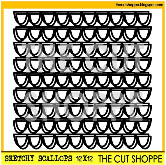
Hey there! I am so excited to be the guest designer at The Cut Shoppe today! I've really been into these files lately. There are so many great ways to use them. Today I used the Sketchy Scallops background file.

I dont know about you, but back to school feels like the start of a new year to me. The summer is all about family, September is all about getting back to me. This layout is a playful way of reminding myself how I feel right now. 


I started by scaling the file to about 9"x9".  Sometimes I like to alter cut files to suit my needs. I took the finished file, then cut it apart so I could layer the scallop strips. I used them above the photo upside down, 


and below my photo, right side up. 

The layered scallops turned out exactly as I has imagined and they added just the right touch to my page. 

Thanks for stopping by my creative view today. Come back again soon. It's going to be a busy week around here!

Supplies: Cs-American Crafts, PP, chipboard, die cuts-Simple Stories, sequins-Doodlebug Designs, cut file The Cut Shoppe-Sketchy Scallops , mist-Heidi Swapp


Stuck?! Sketches

Thursday, September 15, 2016

Hey there! As part of the Birthday Bash going on at Stuck?! Sketches this month, things are changes around a bit.  Today I have a sketch to share with you, but you must head over to the blog to see what else is going on!

Remember, we have some incredible sponsors and prizes to give away this month.

Here is our newest sketch! Isn't it great?  I can't wait to show you how I used it! Stay tuned!


Now head over to the Stuck?! Sketches blog to see some amazing layouts inspired by this sketch and maybe even a surprise!

Thanks for stopping by my creative view today! Like I said, you'll have to stay tuned for my reveal, so please come back again soon!


Nani's Cup

Thursday, September 1, 2016

Holy Moly it's September. How is the world did that happen so fast? Well, another new month means a new sketch challenge at Stuck?1 Sketches. We are celebrating our 3ed Anniversary and there are lots of surprises coming up on the blog all month long! 


First up today is our first sketch of the month.   Isn't is lovely?


 I loved using this sketch. There are so many ways I could have used this because it lends itself to all kinds of moods. I settled on a softer feminine feel to match the photo of the floral coffee cups.  I shortened the large paper strip and moved the small strip to the outer edge. I did that to make the page feel smaller. I also loved this floral circle doily cut file from Just Nick Studio, who is one of our sponsors this month! I layered it over the top of the photo. using pop dots to give it some extra dimension.  See that awesome flair? It's from Accent Scrapbooking, another one of our sponsors. The colors went with my page perfectly! Lastly, I moved the title a littleton exaggerate the cluster in the corner.


I really hope you join the party this month and celebrate with us this month. There will be so much inspiration! 

Thanks for stopping by my creative view today. Hope to see you again soon!

Supplies: PP, premade die cuts, tags, alphas and puffy stickers-Fancy Pants Designs, cut file Just Nick Studio, flair-Accent Scrapbooking, enamel dots-prefer, mist-Heidi Swapp, Silhouette


FREE BLOGGER TEMPLATE BY DESIGNER BLOGS