Sunglasses

Sunday, August 30, 2015

I'm pretty sure this is my last post for August. I don't see much time today or tomorrow for any new projects. What that really means though is that I participated in every challenge I wanted to this month!  Today's page is inspired by the August sketch at Boys Rule Scrapbooking kits and Paper Issues free Printables.  


My family must have an odd thing for sunglasses. I caught him playing with mine and trying to figure out how to put them on the right way. He played with them for a while until he got it right. His smile shows how proud he was of himself.
I liked that this sketch has several layers. I like playing with papers and this enabled me to do that.  I chose to keep the edges straight on all the papers. When I saw the printable, I knew I had to use it. it became an extra visible layer, instead of tucked under.

Thanks for taking a look at my creative view today. a new month, and new school year are right around the corner. Come back to see what's new around here too

Supplies: CS-Bazzill, PP & washi-American Crafts, embellishments-Freckled Fawn, Bella Blvd, American Crafts, printabel-Paper Issues, mist-Studio Calico, doilies-BoBunny, DoodlebugDesign, pen-EK success

A Walk with Tin Foil Man

Saturday, August 29, 2015

Im back! More to share today, taking advantage of a quiet, rainy morning here. I have 2 more pages to share, both inspired by Stuck?! Sketches. Did you see they are having a DT call? Yep, I may have to apply. I find their sketches are designed well and easy to use. I can adapt them to to my style, or use them exactly as they are. I don't usually do one post for both challenges, but, well, today I am.

First up:

Oh, I had fun with this one. I enlarged the photo area with both the size of my photos and the layers beneath them. I have to admit, I started by wanting to use the washi at the top of the page, the colors and papers were selected based on that.  Because the papers all go together, I added some detail to he edge of the papers to give them some definition. I usually ink the edges, but wanted to try something different. The darker color of the title alphas and the page corners, keep the focus on the center of the page. 

I do like how the colors reflect a bright spring day. The walk to the park was more about the journey itself, than being at the park. I think it took almost 30 min to walk the 2 blocks. He was so interested in looking at everything around him.

Supplies: PP-MME, October Afternoon, Paper Issues Swag Bag, Washi-LoraBailora, Freckled Fawn, Hobby Lobby, Flair-October Afternoon, Freckled Fawn, doily-DoodlebugDesign, alphas-PinkFresh, Freckled Fawn, stickers-October Afternoon, Bella Blvd, mist-Heidi Swapp

Next up:

I played with this one a bit more by flipping it on it's side.  I used a journal card and a larger photo, and moved the small banners to the top as an entry into the page. I love creating energy on my pages. The falling stars do just that. Truth? I dropped them and they landed like that. A very happy accident. My favorite thing about this page? Being able to use the sports elements from the ephemera pack! Neither of my boys play team sports. The fact that his PJ's have a sports theme? Bonus!   


So, humor is something else that's always on my pages. In this case, the 'Sorry Not Sorry' as well as the title cater to that.  One night after cleaning up from dinner, my son decided he was fascinated with e tin foil wrapped loaf of bread. He held it for a long time, then tried to leave the table with it, He even tried to take it to bed. He was even smart enough to recognize that the foil wrapped tupperware,we gave him instead,  was not the same! Since then, every time we warm bread in foil, he does the same thing. But only with bread. Tin Foil Man indeed. 

Thanks for taking look at my creative view today. Ive got lots more to share, so come back again soon. 

Supplies: PP- Simple Stories, Die cuts-Simple Stories, Freckled Fawn, wood piece-Crate paper, cork washi-Recollections, enamel dots & alphas-MME, flair-Queen & Co


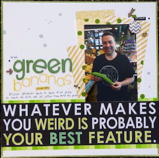
Green Bananas & Shenanigans

Hey there. I have so much going on here today. Nothing like waiting until the last minute. But, well, it's still summer at my house which means lots of time with my children, not so much time with my crafty supplies, let alone blogging. So here goes. These pages are inspired by both August challenges at Scrap Our Stash

First up is the PAPER stash challenge. (Now I remember why I waited so long to write the post. I wanted to retake the photo. Forgive the poor editing ;-) )

In our family, we like to make jokes about each others' silly quirks. In this case, it's my husband's  preference to eat only almost green bananas. No spots, not really yellow. Pretty much green. My son took it upon himself to snap this photo while the two of them were out shopping.  As I was searching for product to use, I remembered I had this Bella Blvd collection. The saying on one of the papers was perfect. I painted the words I wanted to highlight. The combination of yellow and green help tell the story as well. 

Anyway, I used Polka Dots, Alphas & arrows, Paint (I painted the words green), Echo Park (the green background paper) and 3 tiny black Rhinestones.

Next is the sketch + stash challenge


 I played around with the sketch a little by using triangles in place of the rectangular shapes. The rest of the design is fairly evident. I used stripes, Simple Stories and paint/mist.  I liked using a dog themed line mixed with colors and patterns from another line. The result is lighthearted and fun, like the photo.  Some Paper Issues Swag Bag pieces and Printables made their way onto the page, as well as inspiration from the August Pinspire me board. 


Again, my son is showing me his sense of humor. Self Timer Shenanigans indeed. I left my phone at home while I went shopping. I came home to a giggling boy, who couldn't keep this to himself.  "mom, check your phone". So I did. He knows that if he does silly things, especially with my phone, it's going to go public at some point.  He didn't mind this time, and I love seeing him be silly. 


Well, that's it for now. Thanks for looking at my creative view. Check back again later today. Ive got more to share.

Supplies-Green Bananas-CS-American Crafts, PP-Echo Park, Bella Blvd, American Crafts, Washi-LoraBeilora, paint-Crayola, wood pieces-UmmWowStudio, Flair-A Flair for buttons, alphas-Bella Blvd, DoodlebudDesign, stickers-Bella Blvd, Freckled Fawn.

Supplies-Shenanigans-PP-Studio Calico, Simple Stories, Pink Paislee, doily-unknown, wood pieces-Elle's Studio, Studio Calico, enamel dots-Simple Stories, mist-Heidi Swapp, sequins-Swag bag, printable, Paper Issues, stickers-Studio Calico


Photo Op

Tuesday, August 25, 2015

Hey there. A new article has been posted on the Get It Scrapped blog. Today's ideas feature a sketch, adapted from a layout created by  Noell Hyman  for the Get It Scrapped Membership.


I liked the diagonal flow of this sketch, and the idea of steps going up from the bottom left to the top right of the page. It also gave me a chance to play with layering, which Ive really been enjoying lately.

This page is part of a series from my Grandfather's 90th Birthday party at Dodger Stadium.  We were part of the pre-game activities. As a result, we were able to take some family photos on the field before he game started. 

Sketches are a great way to combat creative block as well as learn some design skills. There are several creative team examples in this article. 

Thanks for taking look at my creative view today. Ive got some new things to share, so check back again soon.

Supplies: Cardstock-bazzill, Patterned Paper, stickers, die cuts-Bella Blvd, tags-Freckled Fawn, flair-UmmWowStudio, alphas-Lily Bee, basic Grey, mist-Studio Calico, Dylusions, pen-Sakura, adhesive-EK Success

Hello Fall

Saturday, August 15, 2015

Hey there! It's time for the mid month reveal at Picture This. This time around, we are asking that you use these elements:
2 photos + monochromatic + fall colors

Well, let me tell you. I found this to be challenging indeed! I think I got too much into my own head though. I would find a photo, then realize I needed 2 photos. Or choose a color, and again only find one photo. Finally, I landed on these photos that I took on a morning walk last fall. Brown was an easy choice. It's a great neutral to help the color in the photos shine.


The polka dots give the page some pattern. I embossed the dark brown card stock with a floral motif to go with the outdoor theme of the page. The wood leaves and splattered paint, again enhance the theme. 

Inspiration for this page some from a sketch I found at ScrapMuch? from April 2015.


Thanks for taking a look at my creative view today. August tends to be busy for me. But, summer vacation is winding down around, so I will be back to my frequent bogging shortly.

Supplies: CS-Bazzill, PP-BoBunny, tags-Fancy Pants, Embossing folder-Darice, mist-Heidi Swapp, Wood pieces-Studio Calico, Doily & Sequins-Doodlebug Designs


Just Go

Tuesday, August 11, 2015

Hey there! I'm up on the Get It Scrapped blog today. This newest article is discussing a two-page layout that is "bracketed" by something at far right and something at far left.   I often create 2 page layouts. When I do, I am usually conscious about balance and flow, but not necessarily if I "bracket" my photos.  I love learning something new, so I was ready for this assignment.


My son is going into the ocean by himself for the first time. He was both afraid and excited at the same time. I took a series of photo of him getting in, turning around to see that I was there, then finally enjoying himself. 
 
I used the bracket idea in two ways. First, I repeated the diamond patterned paper in a more traditional way, on both outer edges of the layout. I also repeated the color red on both sides of the layout, but is it more prominent on the left side. I used red as an accent on the right side. The result is a visual triangle of red across the two pages.

Thanks for taking a look at my creative view today. It's the last few weeks f summer and I'm trying to soak up every minute. I may not be creating, but I'll be posting things I made over the past 2 weeks, as often as I can 
Supplies: CardStock-Bazzill, patterned paper-Basic Grey, wood pieces-American Crafts, Pink Paislee, Studio Calico, Freckled Fawn,  stickers-Basic Grey, Freckled Fawn, Lily Bee, enamel dots-Freckled Fawn, My Minds Eye, journal tag-Fancy Pants. Alphas-My Minds Eye, American Crafts, thread-DMC, pen-Sakura, adhesive-EK Success

House hunting

Saturday, August 1, 2015

Hello there. Its August. Wow. Well, a new month means a new challenge at Picture This. the challenge elements are

one photo + 2 patterned papers + black background

And here you go: I used a textured cardstock base. I used both sides of one piece pf patterned paper as my two patterns. the rest are journaling cards, stickers, and die cuts.  I used the wood numbers not only to work the flow around the page, bt also to represent the amount of houses that we looked at.


We spent hours and hours over there course of two weekends looking for a house for our move. Somehow, he still had a smile on his face. Maybe he was looking at the listing of the house we bought.  

Design inspiration for this page comes from the July Sketch At Boys Rule Scrapbook Kits. I replaced the round objects for the squared journal tags, and moved the embellishment cluster from the bottom to the top.


Thanks for taking a look at my creative view today.  Come back again soon. I always have something new to share

Supplies: CS-Bazzill, PP-Fancy Pants, journal card-Pink Paislee, chipboard-Simple Stories, die cuts-Jillibean Soup, sticker-Basic Grey, Washi, buttons & brads-MME, enamel pieces-Doodlebug Designs, wood pieces-UmWow Studios, paint-Dylusions,Studio Calico, Heidi Swapp,  


FREE BLOGGER TEMPLATE BY DESIGNER BLOGS