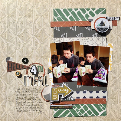
Good morning! Today at Get It Scrapped we are talking about using Contrast to create Flow on scrapbook pages. When we use contrast in our designs we should do so with purpose and intention.
I worked with mostly neutrals on this page, creating contrast with the rust and green. Focus is kept on the photos being anchored by both colors in the vertical paper pieces. Flow is created with the title pointing towards the photos, also in the same rust and green colors. From there your eye should see the embellishments under the photos, moving top toward the top of the page, back again to the title area.
He finallyt hit that age where he's always hungry. He cam home from school, went to the fridge, took out the leftovers and ate. Barely saying hello.
Thanks so much for stopping by my creative view today. Come back again soon, I always have more to share.Supplies: patterned paper, die cuts, stinters, alphas-PinkFresh Studios, die cut -Paper Issues, Silhouette, pen and adhesive-EK Successs


No comments:
Post a Comment