20 minute Layout (more new things)

Tuesday, October 30, 2012

If you know me, you know I'm usually up for a creative challenge.  I find they spark my creativity anyway.  So, when I was recently presented with the 20 minute challenge- create a LO in 20 minutes or less, how could I resist?

I made this one first.  I was able to do it quickly because part of it was a kit I had prepared to take to a crop.  I love BoBunny's summer lines. I bought the chipboard too, but always forget to use it. Not today! I added a little banner and some washi tape clusters and that was it. done.


This one I did today for Club CK Issue Challenge, using vellum.  The card stock and PP were already together. (I had put them together for another project, then changed my mind).  I quickly decided on photo placement, then added the red doodlebug twine, Target and Queen & Co Trendy Tape, some random buttons & brads.   I used Lawn Fawn alpha stamps, then heat embossed the title. It took a little time, but I still made it in 20 minutes!


Thanks for the idea. I'll have to try that again!


New things!

I've been busy again....but scrapping this time!  I have quite a few Layouts to post, but for now I'll start with this one.  I will add more later.  I won't keep you, so here goes.


This next one is for both ScrapFit and Frosted Designs.  I used the sketch from ScrapFit, and the misting with stencils from Frosted Designs.
I'm thrilled with how it came out! I was stuck on how to do this photo. He CRASHED in the hotel room after being outside at the poo ALL DAY! I just didn't know which direction I wanted to take with the design and papers. Enter challenge blogs! The sketch was great. It was simple enough, but with lots of leeway to play and make it my own.   Well, mist  was a great way to make it my own!  Besides, mist seems to make an appearance on many of my pages lately. I love the variety of ways mist can change a page.   I used some bitty things as well as a banner. Sweet?  Maybe. He may be a boy, but there is nothing sweeter than a child sleeping.  

Papers are all MyMinds Eye. Banner chipboard is Basic Grey. Twine is also MME. Tattered Angels mist. Crafters Workshop stencil. AC buttons and paper flower, Doodlebug alpha stickers, Studio Calico stars. Beads are from Fred Meyer market!

Creating Keepsakes Nov/Dec Issue!

Tuesday, October 23, 2012

Well, today the new issue of Creating Keepsakes Magazine hit the news stands today!


Why is this important?  I contributed to this issue! Way back in January, I submitted an idea for an article. Much to my surprise, not only was my idea accepted, so was one of my layouts.

The article Thankful for You is the result, and my layout is on page 44.

(As seen in the Nov/Dec 2012 Issue of Creating Keepsakes magazine. Copyright Creative Crafts Group. Posted with prior permission from the publisher)

If you are interested in purchasing a copy, you can find a print issue here, and the digital copy here 
There is special online content and downloads available as well. You can find them here

Peek!

Wednesday, October 17, 2012

I'm so excited to share this LO today! It's time for the art supply challenge at Child's Play Challenges.

Googly Eyes!!!!

And I knew exactly what I wanted to do! (and NO, it isn't a Halloween page)  My younger son made up this game of looking under the door when he was about 3 years old.  All I could think of is PEEKing under the door or PEEK-a-boo, I see you!  (You know, eyes, see, PEEK). Oh, and he still plays this game today!

It's a simple page because it isn't a great photo.  I used Making Memories paint, to do the background colors. I chose green and blue to pick up the colors in both boys pajamas.  I matted the photo on some very old Basic Grey paper.  I only had one set of BoBunny chipboard eyes, so I used some random white buttons and threaded them with black floss to get the same look. A little doodlebug green twine wrapped around the journaling picks up the green again.  I inked the edges and hand drew the stitching to bring the focus in a little.

So I hope you will come check out this week's inspiration over at Child's Play Challenges!

I scraplifted this LO from the Sept/Oct Issue of Creating Keepsakes magazine.


Number of Photos Blog Hop

Thursday, October 11, 2012

Just wanted to post the winner of my giveaway!  
Congrats Becky!  Goodies are coming your way!


Hi there and welcome to the Number of Photos Blog Hop.  We need to get a little business out of the way first:  You should have arrived here from Colleen's blog.  If not, please go to Amanda's blog and begin there.

I procrastinated deciding on an idea for this blog hop.  I chose to work with 4 photos.  Part of me thought I should have chosen a different amount of photos to work with.  I like to use multiple photos on my pages, so regardless of number, it should have been easy for me and it wasn't.  Luckily, a topic and photo opportunity fell in my lap over the weekend.  The design and products fell into place rather quickly after that.
Here is my LO.

The photos are not really the story being told. They are the visual documentation of the story. They are actually the least important part of this page. They are bold, busy and out of focus, but I needed to use them. I knew I wanted to use the "day 1", etc with each photo. Journaling beyond that, I wasn't sure. I did have difficulty with a title, and am happy with what I chose, and where I placed it.  My favorite part are the balloons.  I added flock over them, then added Stickles to shine them up a bit.  I broke my cardinal rule of "leave well enough alone" by adding a bit of journaling at the last minute

There is more journaling, in fact there is a whole story. If you are interested in reading it, you can find it  on my other blog, Beach Girl At Heart

Thanks for stopping by.  I have a small giveaway.  Please leave a comment to be entered.  If this is your first time visiting, remember to become a follower as well.  Your next stop is Carolyn's blog.

Supplies:
PP-Sandylion
CS-random
Bazzill In stich'z template
DMC floss
Ink-Colorbox
Sassafrass and AC alphas
Souffle pen
Doodlebug flock
Stickles
MS glitter

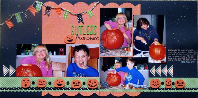
Gutless!

Wednesday, October 10, 2012

Wow, I have been in desperate need of some MoJo! I haven't had consistent time to scrap lately and it's really taken it's toll on my creative flow.  I try to browse scrappy sites and blogs daily, so I don't lose touch, but I guess it hasn't been enough.  However, while browsing, I found a challenge site called Black with Two.  Normally, I don't do well with color challenges, but this months combination of black, with lime green and orange was something I could work with!  I also have to say thanks to my friend csescrap13 who is hosting the weekly challenge over at Club CK. She posted a wonderfully  inspriring sketch by Scrapbook Generation that was my starting point!


There is nothing better for halloween photos than black, orange and green!  I think I did a good job with the colors and of limiting use of white.  I keep my Halloween stuff separated so it was easy to find what I needed.

I pulled out some SEI and Echo Park  PP. The Jacks were an SEI border that I cut and separated. Fiskars and EK Success scallop punches I think feel like the round ridges in the pumpkins. Some WRMK, Queen & Co, and Target washi tape flags on some Doodlebug twine ties it all together.  AC Thickers and Doodlebug letter stickers made the title.  Lately, I can't leave a page alone with out mist of some sort. Today I tried some Fireworks.  Not sure how I feel about it yet.  It is supposed to dry opaque, we'll see.  One of my favorite things?  SoufflĂ© pens for the journaling.  They are so awesome for writing on dark paper and I don't use them that often.
 
FREE BLOGGER TEMPLATE BY DESIGNER BLOGS